Shout
- v4.1.1
- 71
- 739,390
A simple inline contextual notice for Filament forms and infolist, basically just a fancy placeholder.
-
filament
-
filament-plugin

Package health
Automated checks of this package
Compatibility
| Version | Filament | PHP | Laravel | Latest | Docs |
|---|---|---|---|---|---|
| 4.x (Current) | ^4.0|^5.0 | ^8.2 | ^11.28|^12.0|^13.0 * | v4.1.1 | 4.x docs |
| 3.x | ^4.0 | ^8.2 | ^11.28|^12.0|^13.0 * | v3.0.1 | — |
| 2.x | ^3.0 | ^8.1 | ^10.45|^11.0|^12.0|^13.0 * | v2.1.0 | — |
| 1.x | ^2.0 | ^8.0 | ^8.6|^9.0|^10.0 * | v1.0.1 | — |
* Taken from the Filament versions this release supports, using the newest release of each.
Shout is a schema component that renders a contextual notice — a coloured, icon-prefixed callout — directly inside a Filament form or infolist. It is a fancy placeholder: a way to explain, warn, or draw attention to something at the exact point in a schema where the reader needs it, rather than in a tooltip or a hint somewhere off to the side.
use Awcodes\Shout\Components\Shout;

Shout::make('so-important')
    ->content('This is a test')
It is not a field
A Shout holds no state. It is registered with a name so that Filament can address it within the schema, but it is never dehydrated, so it contributes nothing to the form's data and nothing needs to exist for it on your model.
That also means a Shout can be dropped into any schema without a migration, a cast, or a validation rule.
Types
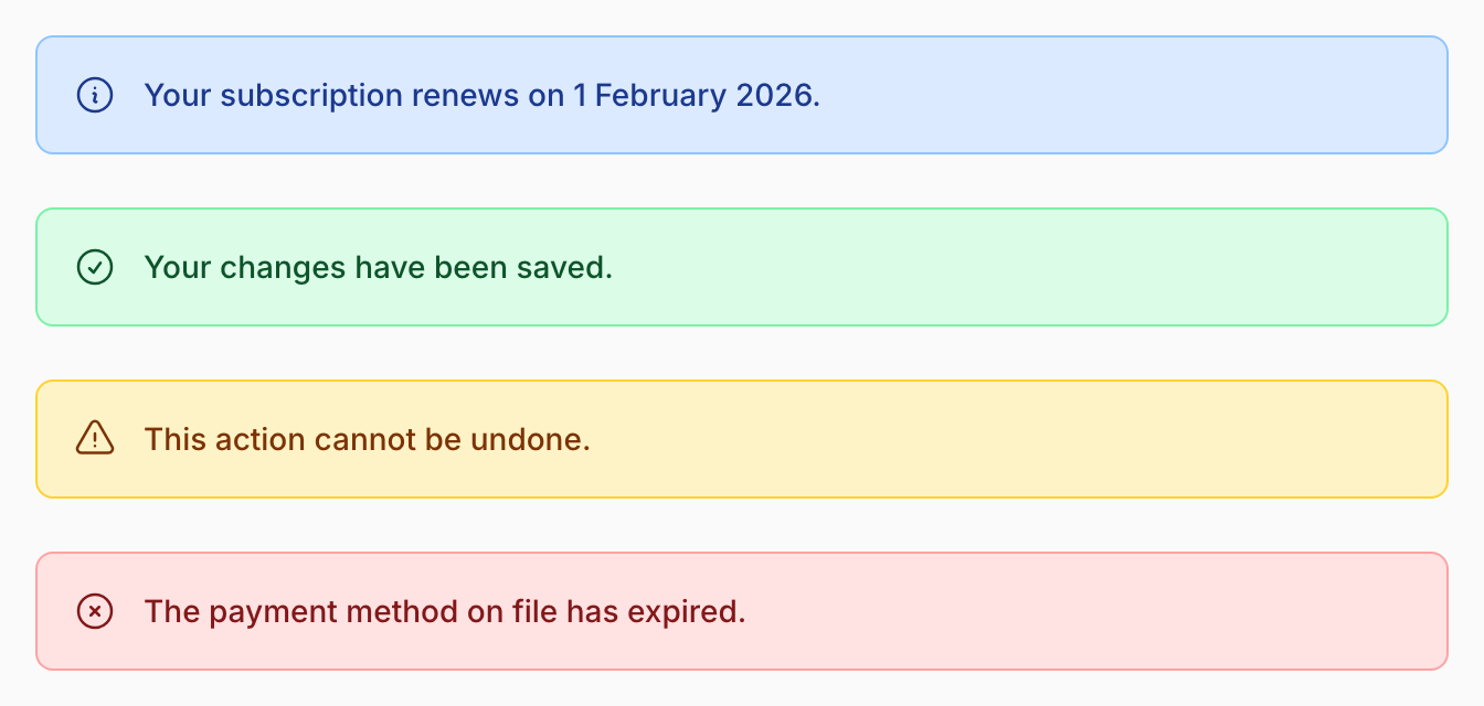
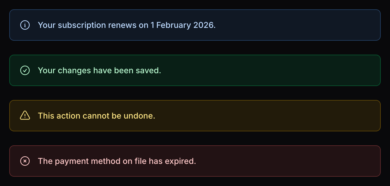
Every Shout has a type, which sets its colour and its default icon in one call. There are four:
| Type | Colour | Icon |
|---|---|---|
info |
info |
heroicon-o-information-circle |
success |
success |
heroicon-o-check-circle |
warning |
warning |
heroicon-o-exclamation-triangle |
danger |
danger |
heroicon-o-x-circle |
info is the default, so a Shout with no type set is a blue informational notice.
What you can control
Beyond the type, each Shout accepts:
- Content — the body text, as a string, an
HtmlString, or a closure. - Heading — an optional bold title above the content.
- Colour — any Filament colour, overriding the one implied by the type.
- Icon — any icon, at any size, or none at all.
- Actions — Filament actions rendered below the content, or inline beside it.
See Usage for all of them.
Next steps
Start with Installation. Shout ships Blade views that need to be picked up by your Tailwind build, so there is one step beyond composer require.